After a few months and some hard work, I think I finally completed Gunnar's logo. All I have to do is get it approved! haha I'm waiting for Gunnar to get back from his photo shoot in Duluth so I can talk to him about the logo. But since you guys aren't in Duluth I'll give you a preview. No thanks required, MY TREAT!
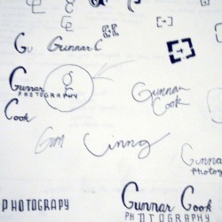
FIRST STAGE: sketches
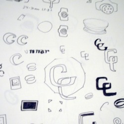
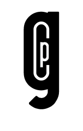
SECOND STAGE: mach-ups

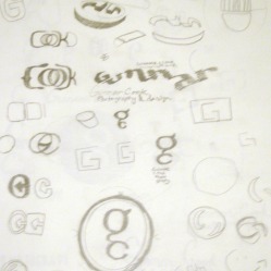
THIRD STEP: revisit the concept and change approach
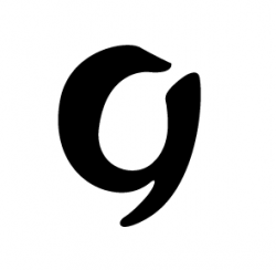
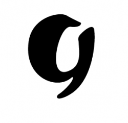
refine...refine...refine...
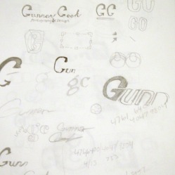
FOURTH STEP: add letter forms
I really thought I was heading in a good direction with these letterforms since the mimicked the characteristics of the mark BUT then I came back a day later with fresh eyes and realized that there needs to be a better solution.
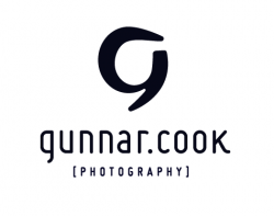
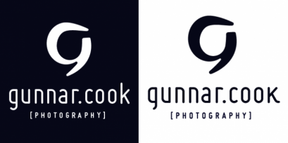
a friend gave me a tip on this font called MISO. I tried it and explored a few other options but came back to "miso" and I love it. It gives it the edge im going for.
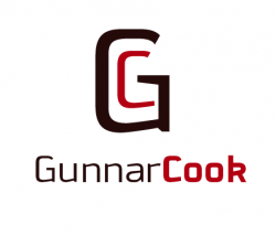
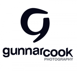
AND THE FINAL (maybe)
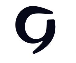
The Concept behind this is:
Gunnar is an up-and-coming photographer from Hastings Minnesota. His style is a refreshing alternative and promises innovative work in the future. The mark is a "freeze frame", if you will, of a lowercase g transforming into and uppercase G. This concept pays homage to Gunnar's transition from avid amateur photographer into an entrepreneur/professional. He is out to set a new standard for Hastings photography and I can not wait to see where his drive leads him.
Gunnar is an up-and-coming photographer from Hastings Minnesota. His style is a refreshing alternative and promises innovative work in the future. The mark is a "freeze frame", if you will, of a lowercase g transforming into and uppercase G. This concept pays homage to Gunnar's transition from avid amateur photographer into an entrepreneur/professional. He is out to set a new standard for Hastings photography and I can not wait to see where his drive leads him.
 RSS Feed