Like I promised you in a previous post, I am not delivering you yet another class project!
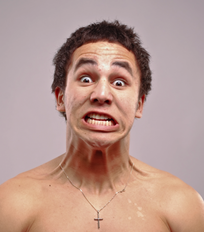
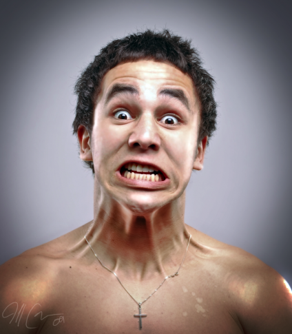
FOr my photography course, we were to pick a photographer and take photos in his/her style. I chose Jill Greenberg not only because her images are striking but also because I wanted to research a photographer that has his/her hands in the advertising biz. Choosing Greenberg for this project also let me have some fun in Photoshop.
Here is the video I did for my class presentation.
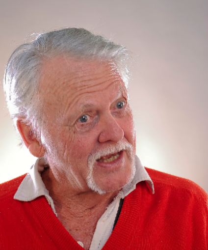
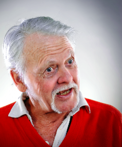
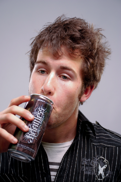
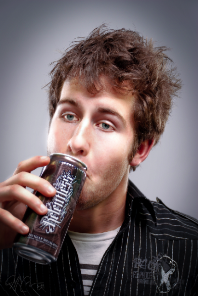
"before and afters" of the models
This fello is Rob Davies, a Brit who moved to NZ a while ago. He was charming and very natural in front of the camera due to his acting background. During this shoot he gave me a lot of good pics. Thanks Rob!
Graham is a good cunt as they say in NZ. He was the first to volunteer for this shoot. I think he has a shot at become a hand model. Thanks Graham
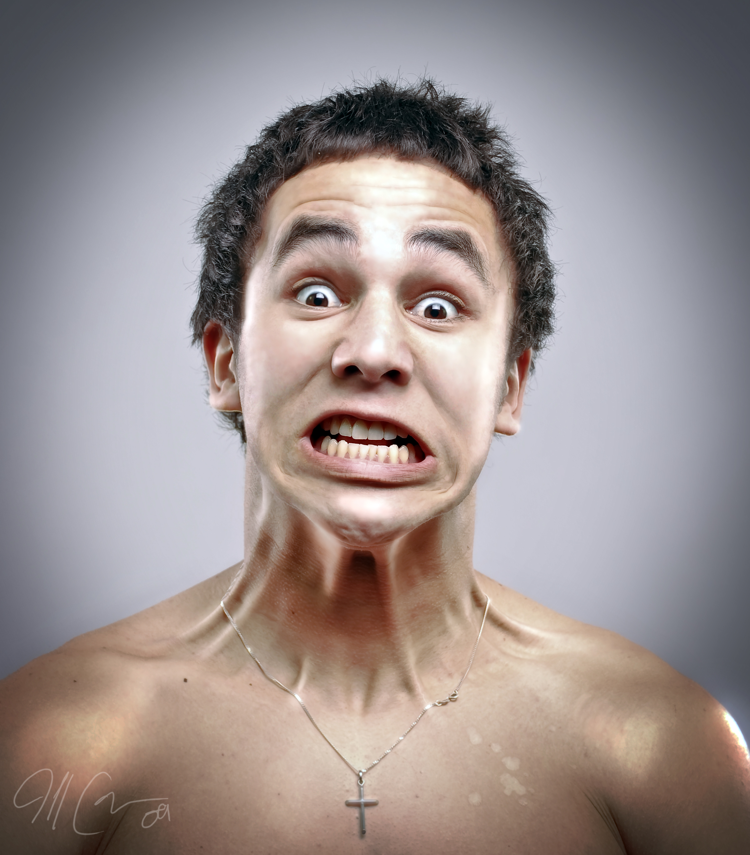
This is my favorite one. Naturally Sean is photogenic so this time he wanted to step outside the realm of beauty and try something different. He proposed the neck stretch and we went with it. It produced some interesting! Thanks Sean!
I hooked it up with some files for you folks to download. These pics are really sharp and look good close up. Give em try.

| Click here to upload file |
| | |
| | |
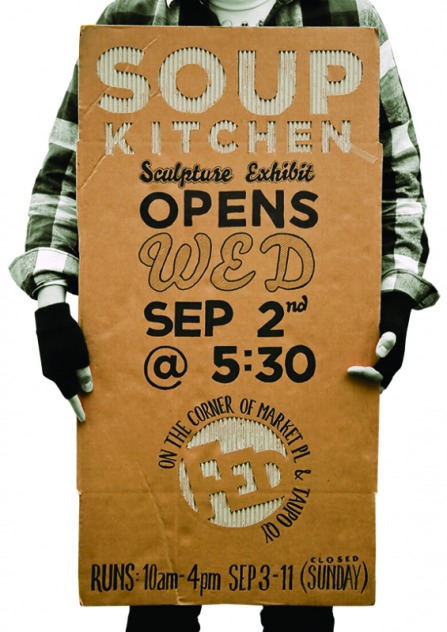
For my sculpture course here we are hosting an exhibit. The exhibit is titled "Soup Kitchen" since we are serving free soup-haha. I was the one that suggested the name and surprisingly it was chosen. I thought there were better suggestions that had more meaning behind them, but I guess things always go that way in the design field (your worst proposals are the ones that are chosen) haha.
But here is the poster
The cardboard will also act as a poster in itself. I think it will stand out amongst the other posters since it is made out of cardboard and 3 feet tall!
The concept behind the poster is pretty simple. Soup Kitchen>feed homeless>hold cardboard signs. I just took advantage of the fact that homeless people have their own unique avenue for displaying messages (no pun intended?). That pun may have been a stretch. Either way, there you have it!
I should be done with my photography project tonight, so expect to see those pics soon.
Staci Paul, a fellow graphic designer, has been working on a logo project and she wanted feedback. So, instead of receiving feedback from just one person (me) I thought I'd take advantage of my blog to get her a few more critiques. Sound good? then please share the love...
This logo is for a man who is starting his own health and fitness website. The site consists of articles all relating to exercise and the biology/mindset of the athlete or person working out.
Go ahead and leave your comments and I'll make sure she receives them. And if you like her work and need a project done, I can set up the lines of communication for you!
For my photography class we each picked a photographer we liked. I picked Jill Greenberg. The next step is to try to emulate their style. Here is my rough wack at it. I only had two lights to work with, Greenberg uses about 8. When I take the real photos I wont shoot the pictures in a hostel lounge.
this is my buddy Sam Tapia. We talk to each other through the vent in the wall. Check out Jill Greenberg at www.themanipulator.com
...and made this!
Download the file to see what it says

| paul_family_low_res.jpg |
| File Size: | 441 kb |
| File Type: | jpg |
Download File
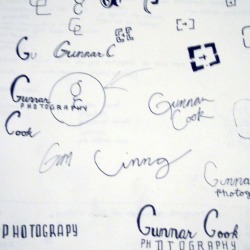
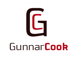
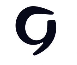
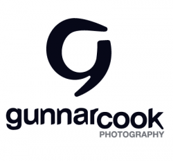
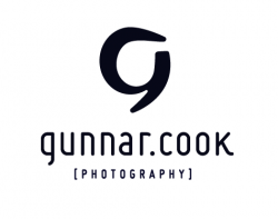
After a few months and some hard work, I think I finally completed Gunnar's logo. All I have to do is get it approved! haha I'm waiting for Gunnar to get back from his photo shoot in Duluth so I can talk to him about the logo. But since you guys aren't in Duluth I'll give you a preview. No thanks required, MY TREAT!
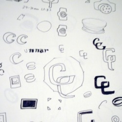
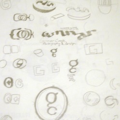
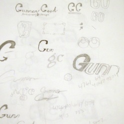
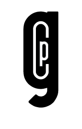
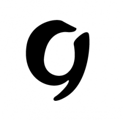
FIRST STAGE: sketches
SECOND STAGE: mach-ups
THIRD STEP: revisit the concept and change approach
refine...refine...refine...
FOURTH STEP: add letter forms
I really thought I was heading in a good direction with these letterforms since the mimicked the characteristics of the mark BUT then I came back a day later with fresh eyes and realized that there needs to be a better solution.
a friend gave me a tip on this font called MISO. I tried it and explored a few other options but came back to "miso" and I love it. It gives it the edge im going for.
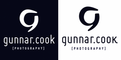
AND THE FINAL (maybe)
The Concept behind this is:
Gunnar is an up-and-coming photographer from Hastings Minnesota. His style is a refreshing alternative and promises innovative work in the future. The mark is a "freeze frame", if you will, of a lowercase g transforming into and uppercase G. This concept pays homage to Gunnar's transition from avid amateur photographer into an entrepreneur/professional. He is out to set a new standard for Hastings photography and I can not wait to see where his drive leads him.
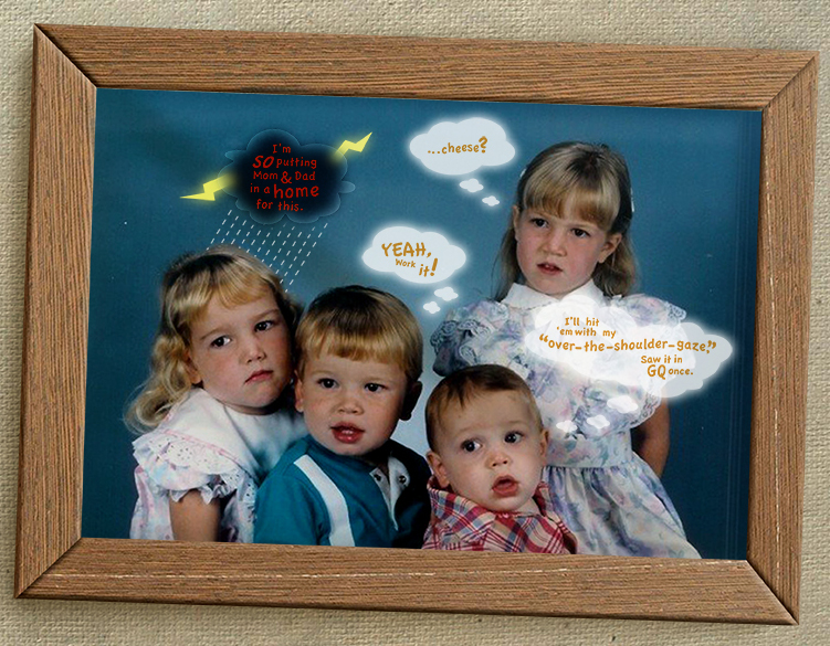
Here is a video my Dad came upon the otherday. I think he recorded this with his old mobile phone. Check it out, I think you'll like it - I DID! This brought back a lot of memories.
Oh, and watch for the moments where Casey and I aberrantly gaze into each other's eyes throughout the song.
there seems to be a lot of good guessers competing for the the prize on this one. I almost gave up sifting through all the wrong guesses because there were so many of them. But after a long list of cookie colloquialisms I found a winner!
The Answer is in fact biscuit and the winner is Staci Paul.
Congratulations Ms. Paul and expect to see your prize in the mail soon.
Cheers
...I'll try to make the next one more difficult.


 RSS Feed